Public Domain Fonts
Here are my dabblings in font design. I have placed them in the Public Domain. This is all 100% my own work. Usage is totally unrestricted. If you want to make derivative works for any purpose, please go ahead.
I welcome comments & constructive criticism.
Put another way, a la PD-self:
I, the copyright holder of this work, hereby release it into the public domain. This applies worldwide.
In case this is not legally possible,
I grant any entity the right to use this work for any purpose, without any conditions, unless such conditions are required by law.
Downloads
These archives include .ttf files as well as FontForge .sfd source files. Starting 2007-11-06, I've included .otf files as well. Mac users -- if you have trouble installing the .ttf files, try the .otf files.
# permalink
14 Jun 2012
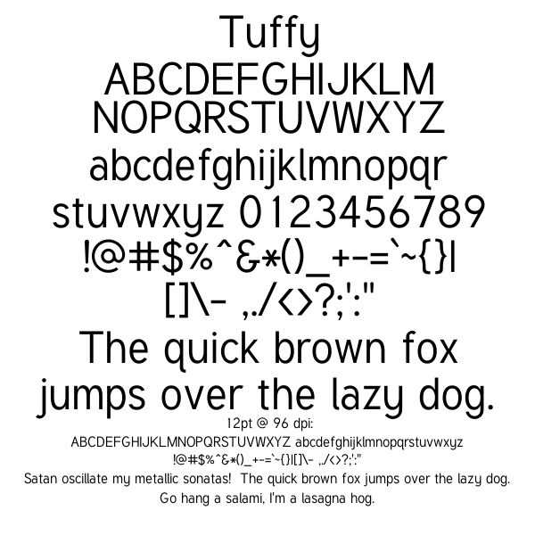
Tuffy 1.28
I made a bunch of small but overdue fixes to some metadata and accents.
# permalink
22 Aug 2011
Tuffy with more characters!
Károly Barta did a ton of work creating Greek, Cyrillic and accented characters for Tuffy, which he has generously contributed back to the public domain Tuffy.
Also, Michael Everson created a Tuffy-derived font, Rupakara, which adds the new Indian Rupee Sign, plus many other currency symbols, and a full set of letters commonly used to transliterate Indian languages. Rupakara is under the SIL Open Font License, but Michael also agreed to let me merge his new characters into the public domain Tuffy.
Tuffy Version 1.27 is the same design as Tuffy 1.1, but with these new characters added in.
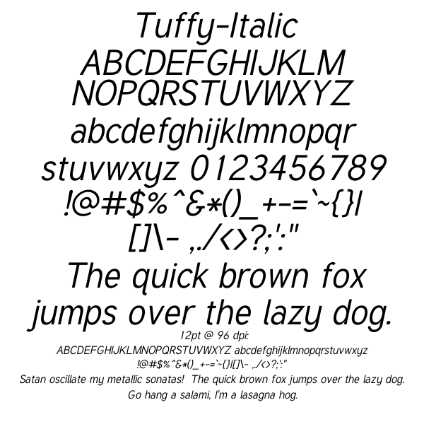
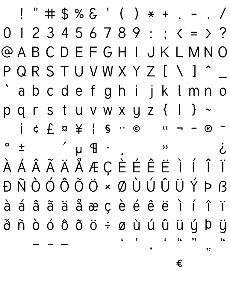
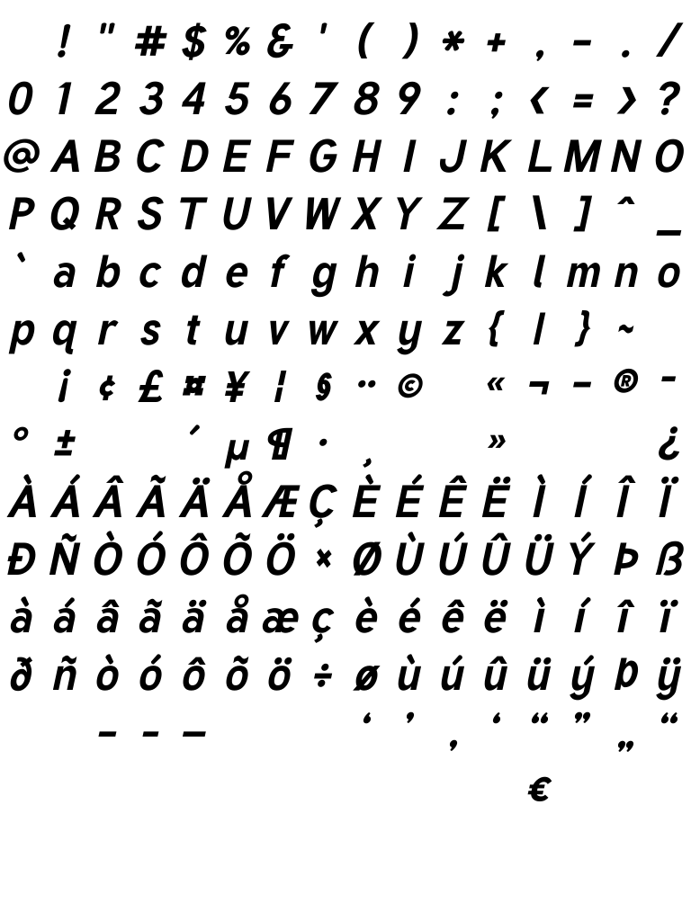
PDF Character maps for Tuffy Regular Tuffy Italic Tuffy Bold Tuffy Bold Italic
Big thanks to Károly and Michael!
# permalink
22 Dec 2009
Creative Use of Tuffy
A decorative font using Tuffy as a base: http://thescrappincop.blogspot.com/2009/12/ryans-font.html
# permalink
6 Nov 2007
OpenType files for Mac Users
I got some interesting email about Tuffy yesterday, one from another "tulrich" -- a guy named Travis Ulrich -- and a separate email from a guy named Devin Tuffy. No joke. Anyway, there was some trouble installing the .ttf files on the Mac ("Missing OpenType Data"), so I tried generating .otf files from FontForge. Reportedly those worked fine. If you see that problem, grab the latest download and try again.
Thanks for the emails & for using Tuffy!
4 Apr Feb 2007
Tuffy Listed in Free Fonts of the Month
Smashing Magazine runs a periodic roundup of high quality free fonts:
# permalink
11 Feb 2007
Return of Tuffy
I did some more work on Tuffy, bringing it to version 1.1. Mainly I cleaned up some curves in Bold and tweaked Regular just a little. The differences from 1.0 are subtle but make it look more polished.
 |
sample charmap |
 |
sample charmap |
 |
sample charmap |
 |
sample charmap |
See above for downloads.
Tuffy might be done now. I'm pretty satisfied with the letters. The numbers and punctuation are a little weaker, but usable.
Making Tuffy turned into a bit of a rathole. For one thing, I discovered that making a font that hangs together is very hard. There are too many letters with too many shapes! For another thing, a generic sans font is especially hard because with something so simple, the eye is very sensitive to any imperfections. It was great for learning FontForge, and practicing Bezier curve editing though.
Artistically, I don't think Tuffy is very interesting. It's really just a mish-mash of things I like from other innocuous fonts, without any overarching message or mood or visual hook behind it. On the other hand, to the extent it's generic, that's exactly what I was going for. I wanted to create something vanilla, but totally unencumbered by copyright, to be both useful in its own right, and to serve as a base for myself and others.
# permalink
29 Jan 2006
Tuffy Variant
I just discovered some derivatives of Tuffy, that can be found here: http://forum.high-logic.com/viewtopic.php?t=1138 This is very cool -- it's more or less what I had in mind when I released Tuffy -- a free base for further work!
# permalink
24 Jan 2006
Open Font Library
Tuffy appears in the Open Font Library. I'm really into the concept of OFL. I love that most of the fonts there are Public Domain. The site desperately needs better thumbnails though.
# permalink
7 Dec 2006
Tuffy Sightings
Tuffy is being added to Debian, under the package name ttf-tuffy!
Tuffy is used in the shareware game Spinnn from Norbyte.
29 Mar 2005
Tuffy Used In Teleprompter Project
Here's an amusing use of Tuffy:
http://www.somejunkwelike.com/backwards/
# permalink
30 Jan 2005
Tuffy Family
Tuffy is now a “family”.


Click font name for bigger image | download zipped ttf's
The Regular is much improved, IMO. I did a bunch of work on Regular to round out the curves and make some letters more symmetrical. I need to repeat those improvements on Bold. The lowercase 'a' has come a long way, from being my least favorite shape, to possibly my most favorite. I caved in and made many of the peculiar shapes more conventional, like the 'a', the 'f', and the 'I'. It was worth it. I made the tail of the lowercase 'l' more curved though, so it's not so wishy-washy.
The “italics” are really obliques, just automatically skewed 12 degrees by FontForge. They look pretty nice though, perhaps better than the upright versions. I guess slanting adds that extra little touch o' class.
# permalink
14 Oct 2004

|
I've been applying a lot of Squint-O-Vision to Tuffy Bold, producing a regular-weight Tuffy. My goal for Tuffy is something almost as innocuous as Helvetica, but distinct from it. It's getting there, sort of. I find myself more and more adopting the solutions of Helvetica and all its clones.
It still looks a little bit too casual to me. I blame my nemesis, the lowercase 'a'. And probably some loose curves here and there. Also the lack of contrast in the stroke width is probably at fault. That's was on purpose, but I think I will have to break away from that to achieve the right look.
I'm probably going to change the 'a' to be more conventional. I'm not 100% sure about the 'l'. I like that little curve at the bottom, but maybe it's stupid.
The serifs on the 'I' and '1' may have to go. The programmer in me hates it when 'l1I' all blend together, but the serifs do look kind of dorky.
Another sure sign of programmer art is that the digits are monospaced. I think the designer term for that is something like "table spaced", for the columns of numbers in all those glossy annual reports...
The x-height is way too short. The overall size of the font is a little too small, as well, for whatever reason. Sizing and spacing, it's all tricky!
Someday when this sucker is all beautiful, I'm hoping to fatten it up again, for the return of Tuffy Bold...
# permalink
13 Sep 2004
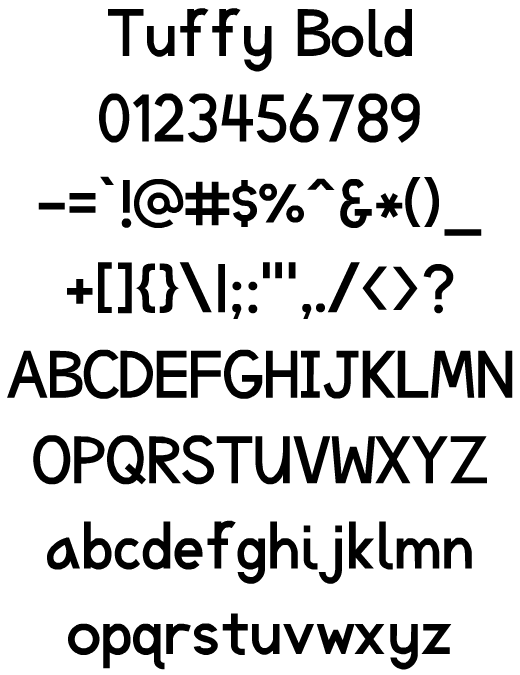
Tuffy Bold
|
Download OpenType | FontForge Source File
My first outline font design. I started with the goal of producing a neutral, readable sans-serif text font. There are lots of "expressive" fonts out there, but I wanted to start with something very plain & clean, something I might want to actually use.
Of course I have no idea what I'm doing, and even less so when I started this font, so I don't think the results are so stellar. But still, I think it looks decent, and hopefully will be a good base for further experiments.
I was aiming for a regular weight, but it kinda turned into a demi-bold. I'm calling it Bold for now; later I'll see about making a Regular version and turning this one into a true Bold.
I picked the name because it's starts with my initials, TU, and it's the name of an old friend's cat, and a quick web search doesn't show any other fonts with the same name.
It's totally unhinted at this point, and therefore looks pretty gnarly at small sizes. The spacing & kerning need a lot more work as well, before it's really usable.
Thoughts
I'm finding font design to be fun, relaxing, sometimes frustrating, and very educational. I don't know if I'll continue doing it, but I've gotten far enough to release some stuff.
Font design is interesting to me because it intersects with technology, visual aesthetics, and writing. There are a lot of choices involved, but a lot of constraints as well, and it's fun to try to balance those out. There's also a craft involved in making attractive shapes, which is fun to learn.
One of the things I've noticed is that the font world is mired in serious ambiguity and murkiness over copyrights. In some countries, like the USA, you can't copyright the designs of letterforms, so technically anybody can trace your font, give it a different name, and resell it. That seems pretty harsh, honestly. I understand that in other countries that's not allowed. On the other hand, all fonts are ultimately derived from truly ancient letterforms, which nobody in our era can legitimately lay claim to. So aside from legalities, the moral issues aren't crystal clear either.
In any case, from the design point of view, it's often a lot easier to start with an existing font and munge it, than to draw everything from scratch. I'm no great gift to design, but my little contribution to this mess is to put my dabblings in the Public Domain.
Tools & Info
FontForge This is the main tool I've been using. It used to be called "pfaedit". It's GPL, has Debian packages, and it's good stuff with tons of features. The documentation is excellent. It includes a lot of info on font design in general, and a bunch of good references for further info.
Apparently you can run it on Windows using Cygwin, but I haven't tried that personally.
TrueType Instruction Compiler I played around with this; it looks pretty good. I haven't tried any TrueType instructing yet, but if/when I do, I will start with this. It's GPL. This guy also has released some other good font tools, and a couple of very nice free font designs.
Microsoft has some very interesting articles on font design. Whatever else they are responsible for, MS has released some of the very best screen fonts in existence.
I've been having a really fun time reading Leslie Cabarga's book, Logo, Font and Lettering Bible ( http://www.logofontandlettering.com/ )
Links
Misc font bookmarks:
http://www.alvit.de/blog/article/20-best-license-free-official-fonts
http://levien.com/type/myfonts/inconsolata.html
http://www.typeworkshop.com/index.php